Nagy Gallery: Fine Art E-commerce
Research / UX-led digital product design case study
Two week solo sprint project, 2017
Software: Sketch, Adobe Photoshop / Indesign / Acrobat
Link: Full Case Study (PDF, 7.8 MB)
Problem
The retail of fine art online is a tricky business: fine art objects by definition are visually, physically and texturally rich, highly prized, highly individual. Not an ideal product for online retail with no access to the physical object. Could a new digital user experience address this?
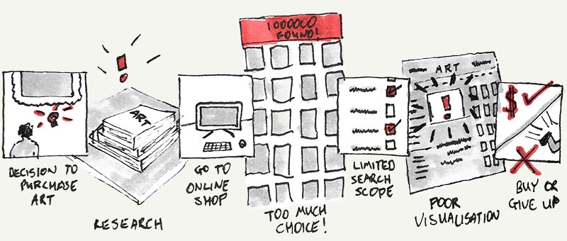
For private buyers, buying fine art is a regarded either as a luxury experience—with all of the associated service expectations—or, for aspiring or first-time buyers, an intimidating one. For professionals such as interior designers buying fine art is often a costly experience: either in terms of the time needed to do it well, or the money spent employing specialist art advisers.
Solution
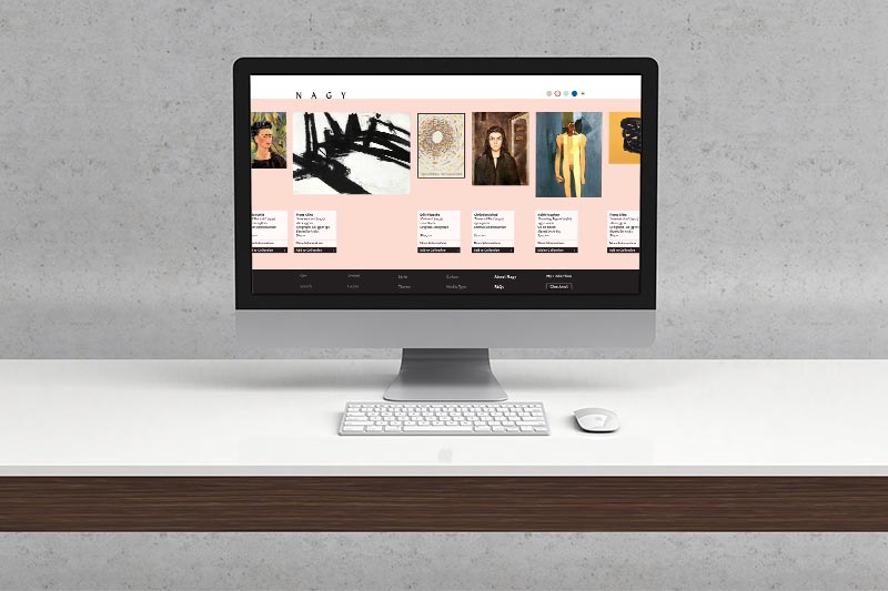
Nagy Gallery is an online edited marketplace fine art retailer, featuring original and reproduction works from galleries and artists, chosen by specialists. It is designed for viewing on high definition and large monitors, reflecting the discerning user base and the requirements of buying fine objects. Led by research, it has been designed from the ground up as a completely new e-commerce experience that better reflects the needs of users, not to mention the objects themselves.
Understanding the User: Research
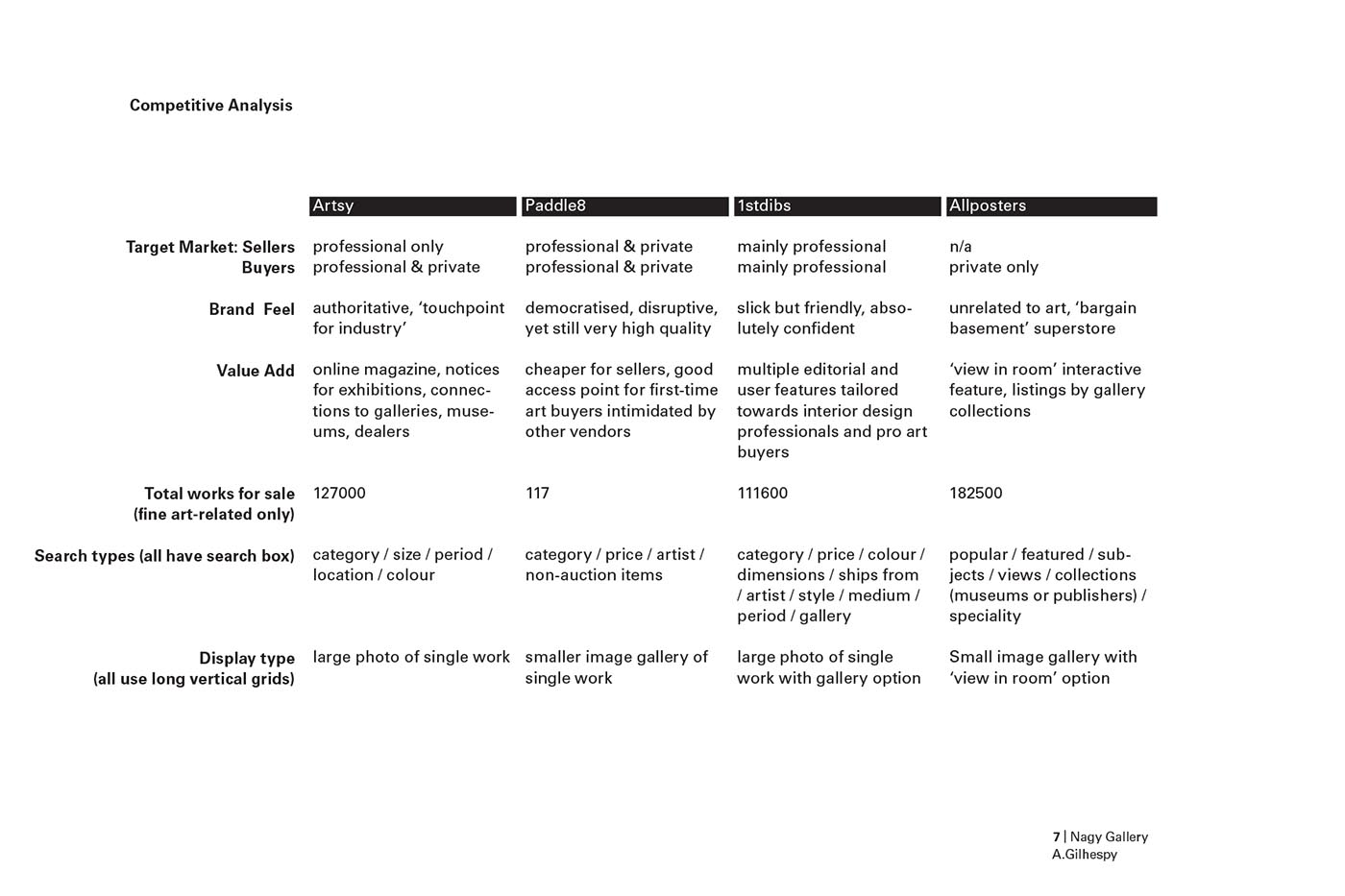
The client (an experienced London gallerist) approached the project with pretty firm ideas about who the user of this site might be and who their competitors were. Research challenges, falsifies, confirms, hones the precepts of stakeholders and designers.
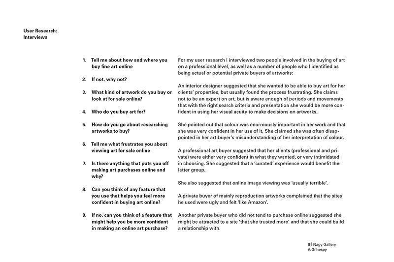
My research took two broad directions: close analysis of competitors (brand, tone, strategy as well as more technical UX analysis), and a series of in-person and telephone interviews with potential users.


Defining Users
The findings of the research allowed me to utilise multiple UX techniques and tools to build empathy with users, refine understanding of who they are and what they need, and provide direction to design ideation.
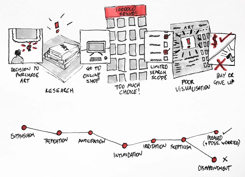
I made a storyboard user journey through current buying experiences, showing user pain points and emotional journey, then developed empathy maps to gain insight into users' positions, interests, motivations.
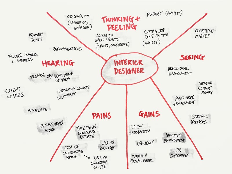
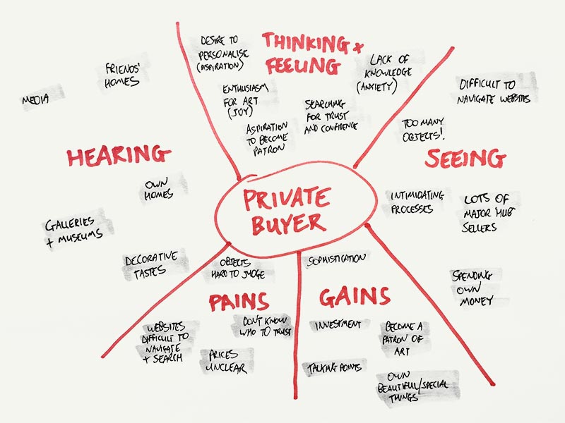
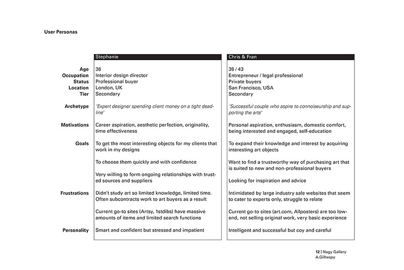
These insights allowed me to develop User Personas for two types of primary user: professional and private users with differing motivations, problems and needs.
Ideate / Design / Test / Iterate
Ideation began around original features not seen in competing offers. These were prioritised for effectiveness to both user personas, originality and, due to the sprint format, time cost. Hand-drawn sketches and paper prototyping of interface ideas and wireframes were used throughout to provide quick, effective testing and iteration. This was especially important as the pressure was on to start designing at higher fidelity early in the project to keep non-technical stakeholders on board.
In spite of these methods, however, the high fidelity designs showed a few further, more granular interaction problems in final user testing. These were recorded and noted for next steps and included in the design presentation, but fell outside of the time limits of the first sprint. Next steps also included further development priorities for a subsequent sprint and suggestions for expanding the service.
Presentation Summary
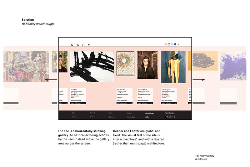
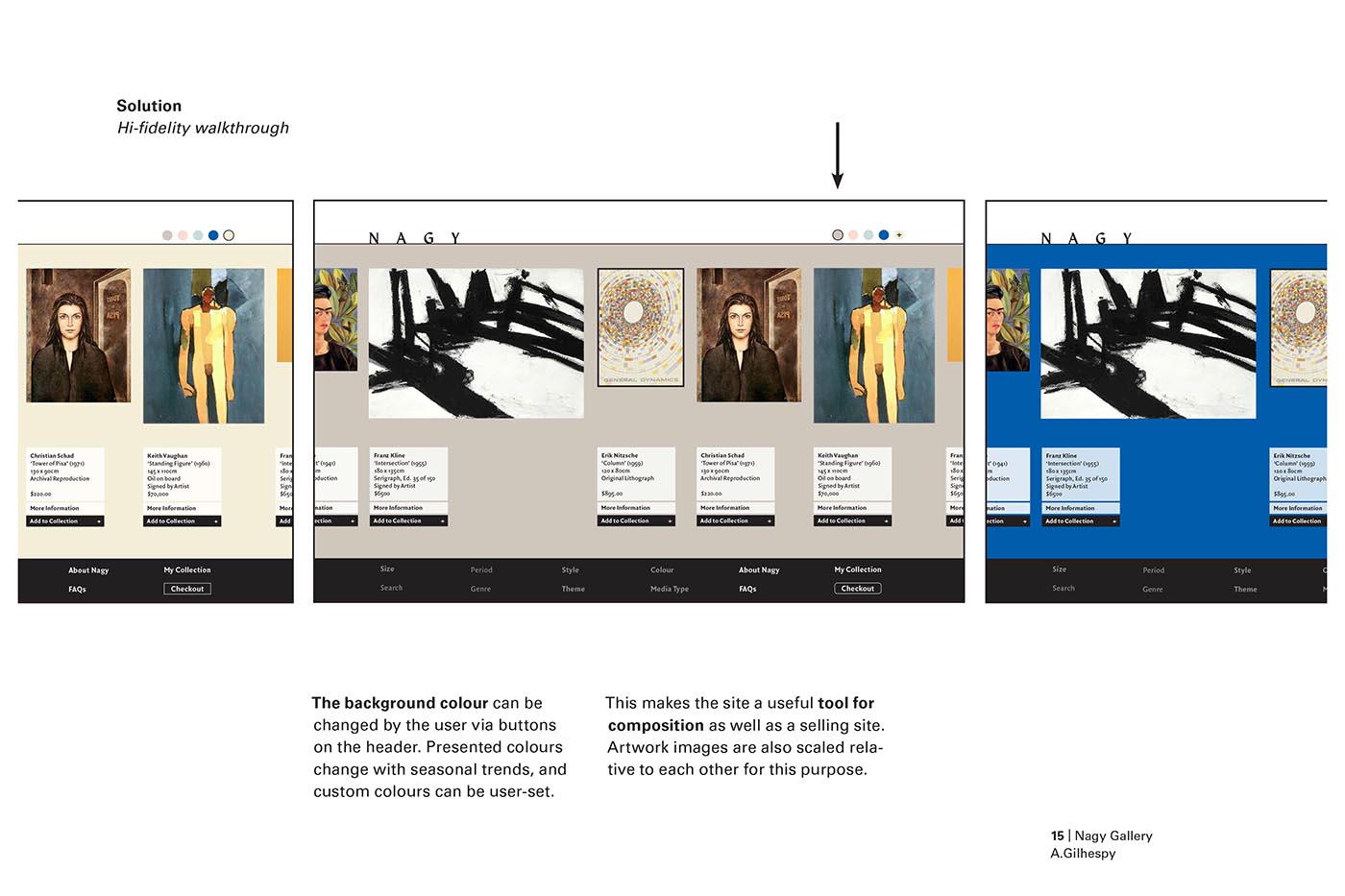
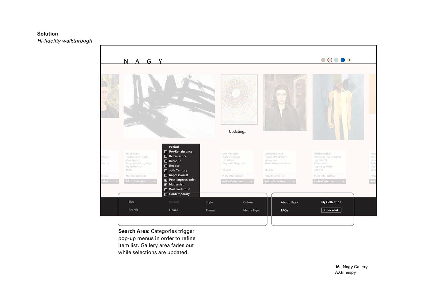
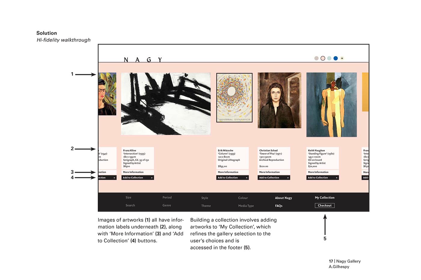
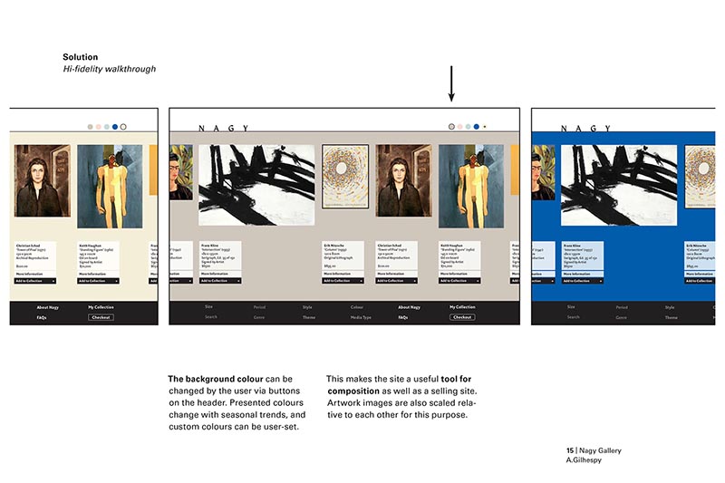
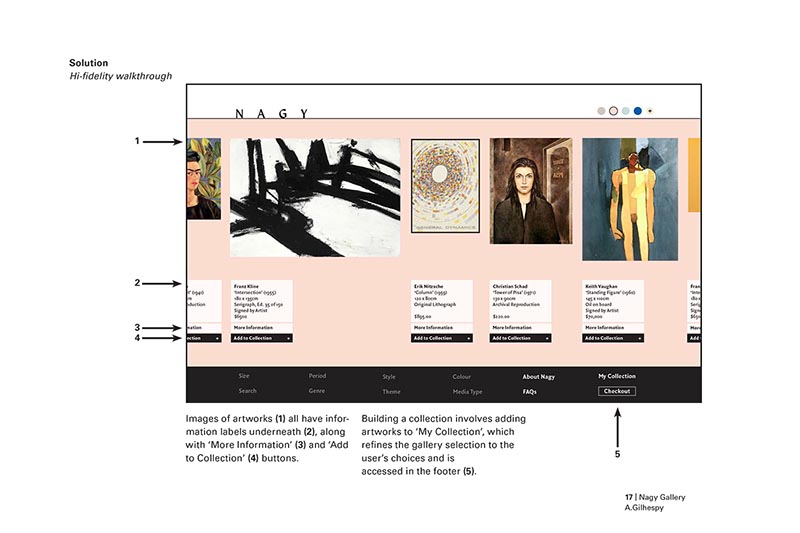
The site features a horizontally scrolling interface that feels more akin to a gallery than an online shop, with inbuilt tools to help professionals and engage other users more richly. Artwork appears 'on the wall', proportionately sized so that users can compare works. The wall colour is user-changeable to a custom or suggested on-trend shade. User flows based on popover modals mean the user feels rooted and 'in the room'.
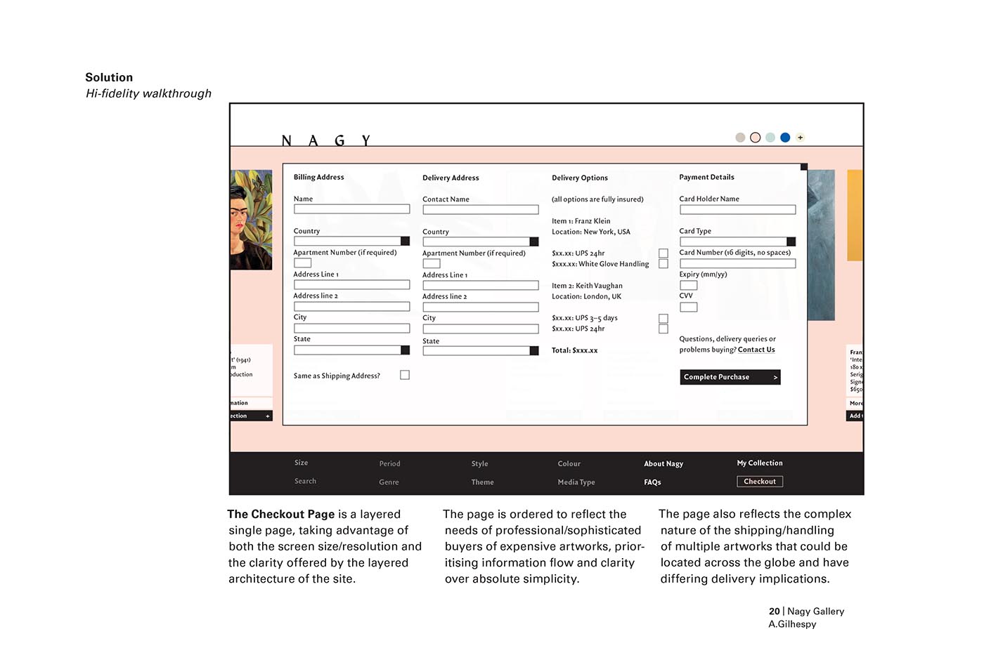
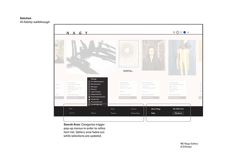

Many of the original interactions designed into the product proved problematic to prototyping software, and so it was decided to present the product instead as a walkthrough series of full-fidelity static screens. These were richly annotated to give good understanding of the information architecture, interactions and user flows of the product, augmented by an in-person presentation.