UX / Product Design Case Study: The Beans
Onboarding for Financial Wellness
Collaborative consultancy, 2017–18
Software: Sketch, Zeplin, Invision, Adobe Illustrator
The Beans is an early stage, seed funded fintech startup in San Francisco led by Melissa Pancoast. Before co-founding The Beans Melissa was a researcher in Behavioural Economics at Oxford University, relocating to Silicon Valley to build a technology and data-driven company focussed on 'Financial Wellness'.
The Beans has developed a proprietary tech platform that analyses its users' fixed outgoings and discretionary spending habits (by connecting to their bank and email accounts) in order to provide tools, information and behavioural 'nudges' that help them improve their financial lives and so their overall wellbeing.
Over the course of six months I worked closely with Melissa and co-founding engineer Matthieu Tourne on various areas of research, service design and UX.

User Onboarding
Balancing complex data gathering requirements with user confidence and engagement
The Beans established comprehensive quantitative and qualitative research projects focussed around groups of school teachers in Grand Rapids, Michigan (and later Atlanta, Georgia). This was both to identify user needs and to provide beta-test participants. The engineering team had developed a basic flow for onboarding beta-testers (via a module in a responsive webpage) and to start getting feedback, which was not good.
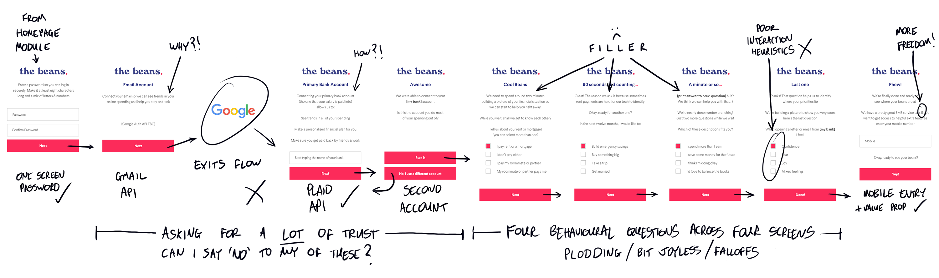
Before: 'MVP' onboarding flow dictated by APIs and data gathering needed by the tech platform. No security or privacy info, a jump to a separate Google UI, many data inputs, no optionality, much filler
Problems
APIs
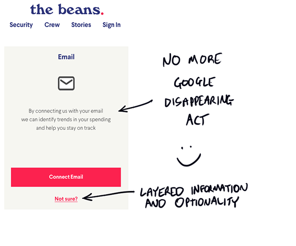
The tech platform developed by The Beans relies on two third party APIs: one from Google (to connect email accounts) and one from Plaid (to connect bank accounts). While the Plaid API had proved easy to integrate into onboarding the Google API had users leave for a separate flow through a Google interface. The developers held that users would recognise it easily, trust it, and respond well.
This view was not shared by user testers: not only were users confused by the jump to and from a Google interface, they raised serious concerns about being asked to allow access to highly personal data without being given any information as to how and why it was used. Far from responding well, users said this flow damaged trust in our service. Falloff at this early point was marked.
Trust Building and Optionality
The Beans have designed their tech platform to provide value to users even if they choose to participate in only some of the services. This was not reflected, however, in the 'minimum viable' onboarding flow, which not only requires completion by the user, but contains no introductory reassurance about security or privacy, no skip options for the core API connections or 'not sure' encouragements or clarifications. This means that user testers were falling off when they had concerns about an action and couldn't skip it or find out more about what requests were being made of them.
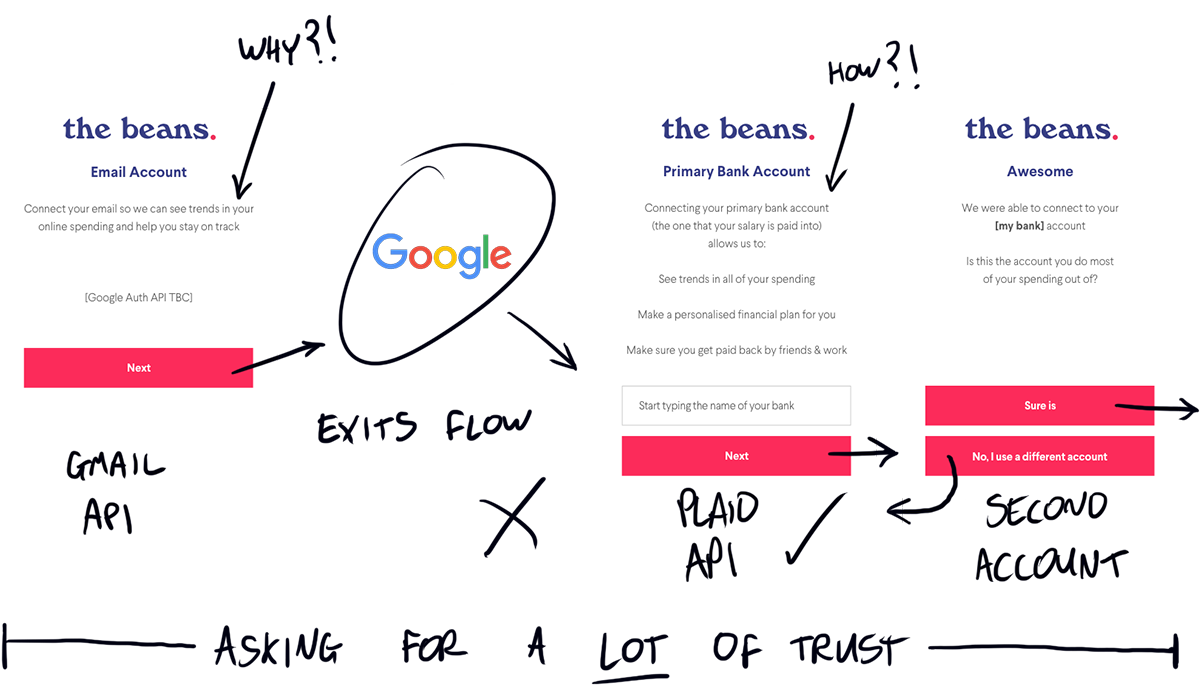
Asking a lot: Users are asked to connect email and potentially multiple bank accounts. Very little explanation of how or why, no security or privacy pledges, no freedom
Data Gathering
The platform attempts to combine the data from email and bank account sources with psychological insights from the user, some of which need to be gathered before they start to use the service. In the existing onboarding flow the user was prompted to answer three questions with radio button answers across three screens. A fourth question about user housing costs was also required to supplement platform limitations.
This part of the flow was thought both by users and the team to be long and clumsy, the question screens filled with trite, repetitive copy to try coax users through and fill the screens. The radio button answer format was also reported by users as feeling dull and repetitive, and safe areas (based on interaction heuristics) around buttons were borderline.
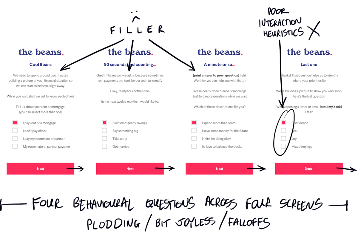
Plodding: Users are asked to answer four questions about their financial behaviours with radio button answers. User feedback here was poor, and everyone on the team thought we could somehow do better
Solutions
In order to encourage more of our user testers through this necessarily complex onboarding process I focussed on finding improvements in three areas:
1/ Build trust. Increase the ratio of transparent, trust building information to interaction prompts and filler. Improve confidence through API flows
2/ Reduce screens and humanise. Streamline and improve interactions. Provide fallbacks and reassurance to users with doubts
3/ Help the user feel in control. Allow optionality through skipping either account connect APIs, provide value in other ways later
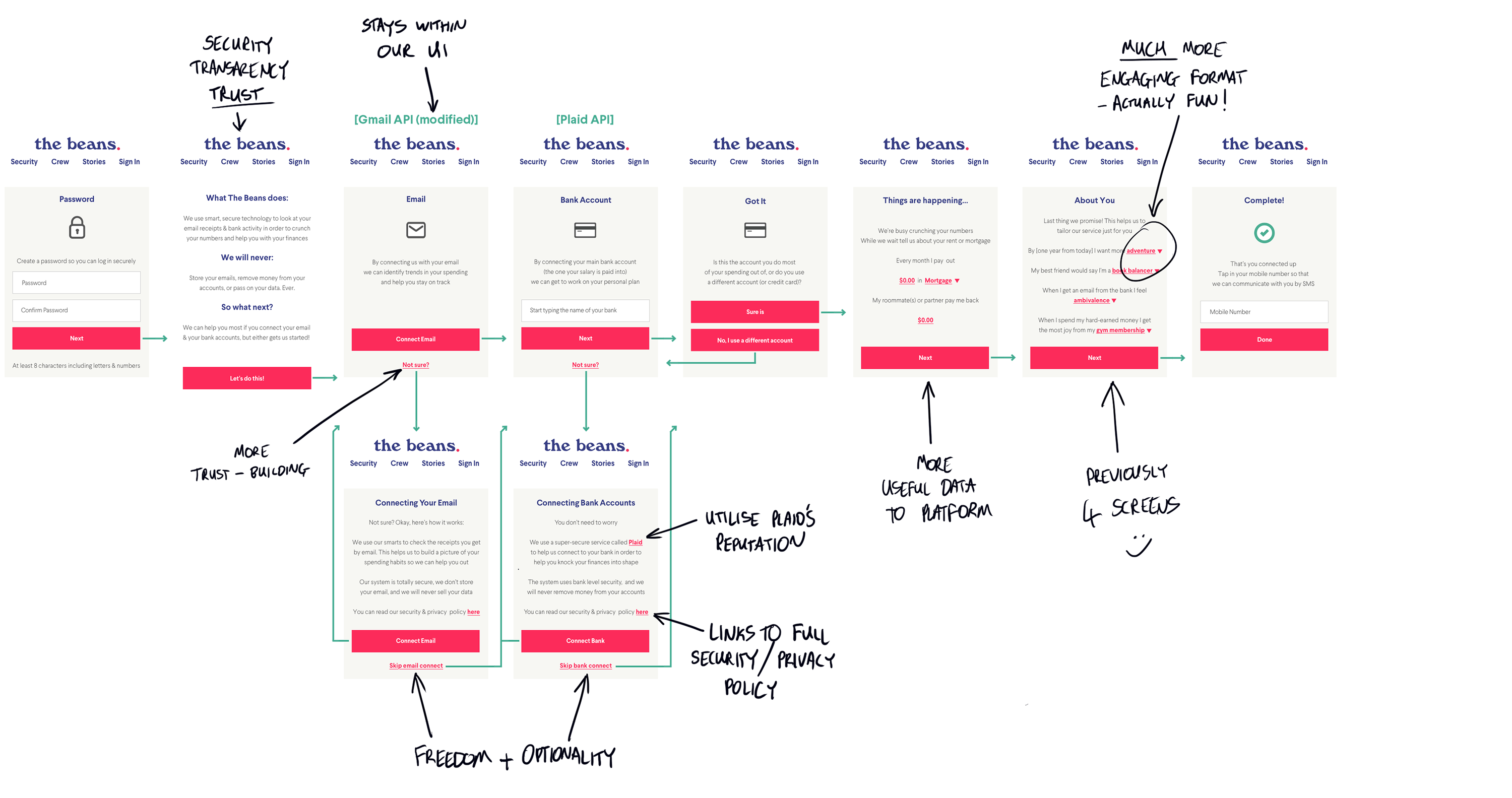
Building Trust Immediately
After password creation the user is presented with a new information-only screen containing a lean, effective set of pledges. The onboarding user is informed or reminded quickly and transparently of what they are signing up to. This copy and formatting was tested and iterated multiple times directly with our research group.
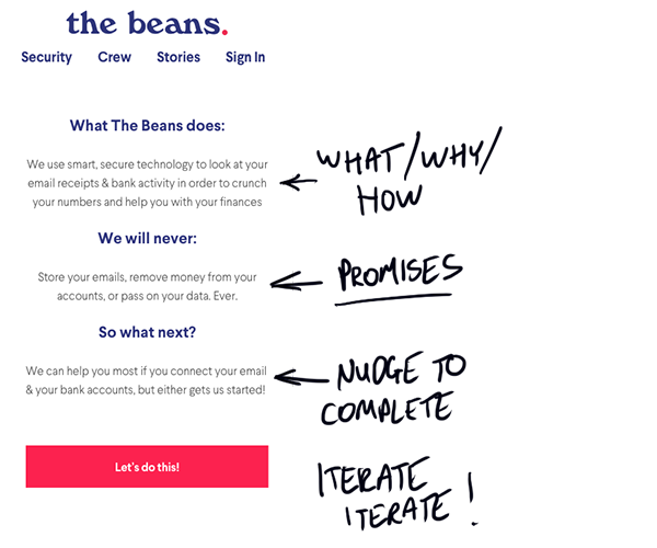
Our Pledge: Users are presented with brief, effective security / privacy info
Keeping APIs in Check
Our developers got to work on hacking and optimising our third party APIs to keep them feeling 'within' our UI feel and flow, and so well-matched to the rest of our onboarding experience.
Consistency: The 3rd party APIs were optimised and 'not sure' links added
User Freedom and Scaled Confidence
'Not sure' links on the connect email and bank account screens allow the user to obtain more information about process, privacy and security on rich information screens that feature links to 3rd party API providers and The Beans' full Security and Privacy Policy page. 'Skip' links give the user the freedom to choose to the service at different levels, or to scale into the service as trust is built.
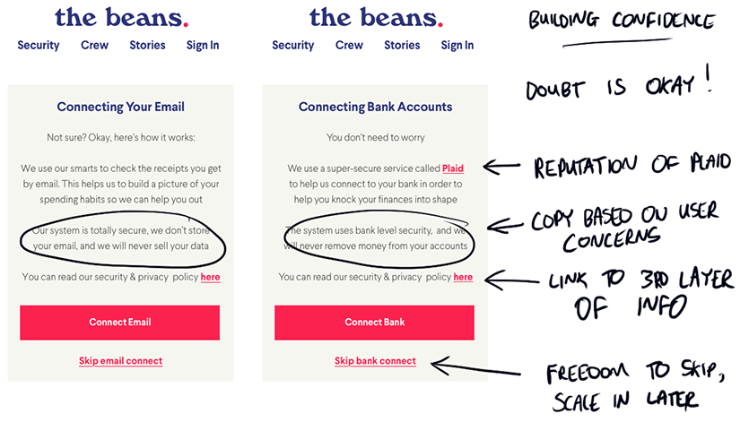
Building Confidence: Secondary screens of more trust-building info from 'not sure' links. Options to learn more about 3rd party providers, read small print, or to skip entirely
More Data, More Fun, Less Junk
The flow of data-gathering screens was reduced from four to two. The housing spend screen was adapted from the original to gain more useful data for the platform (now including figures and sharing arrangements). Users reported improvements in tone and usability.
The remaining questions (in fact we added another) were reformatted to a 'Madlib' format on a single screen. Feedback from users on this interaction was hugely improved from the original radio button questions: testers found the format fun and engaging, and crucially reported that the format made it feel clearer what our service was setting out to achieve.
This format also improved the screens from a heuristic usability testing perspective, with larger safe areas around fewer, clearer interaction points.
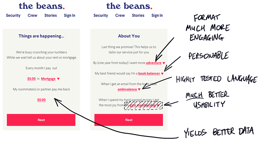
Madlibs: Moving the questions to this format allowed us to do so much more with so much less. User tests were much more positive too.
Conclusions
A complex service based on high levels of user data gathering—especially one in the early stages of development—is never going to be the easiest thing to onboard to. I designed a flow (along with the redesigned homepage at the top of the article that better set user expectations) that, for users, provides more engagement, richer interactions, and builds trust throughout. This was achieved whilst also making the overall process considerably shorter. From the perspective of our platform the flow provides richer, more useful data, much improved user feedback, and much higher onboarding rates.
This project taught me and the team that while consistency and usability of the design allowed us to hone an effective user experience, it was the language and tone that were critical to the project. It was also amazing to learn how testable language can be through thoughtful, skillful user testing, and quite how much it can impact the final user experience and effectiveness of the product.
By the end of the project I learned that, far from being something to merely minimise, a complex onboarding like this can actually be a tool to build relationships with users and gain trust from the beginning, something that many startups neglect to do.